The Obama-Pepsi Connection: Change That is Too Sweet and Still Not Refreshing
When Obama rolled out his iconic logo when he was running for President, many people criticized him for having the audacity to market himself like a soft drink and even those on the left criticized him for ripping off the Pepsi logo.
[ad code=2 align=center]
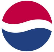
Obama even held his convention at the Pepsi Center. Here is the original Pepsi logo.
And Here is the Obama logo.
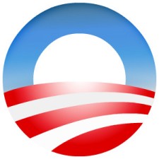
Personally, I always thought that the Obama logo looked much more like the Japanese battle flag of World War 2, but I do understand how many people thought that Obama may have borrowed heavily from the Pepsi logo.
But now Pepsi may be stealing right back from the Obama campaign logo with its own rebranding. Check out what I saw in the grocery store yesterday:

The new pepsi logo looks just like the Obama logo, but now the white area, which to me looks like a sunrise, is offset. Watch when I rotate the logos and compare the two-

Are the Pepsi people trying to capitalize on Obama’s popularity? Both Obama and Pepsi are just fizzy failures. Whatever, I’m sticking to Diet Coke.
Well they are both brown 😆
Lighten up people, it’s a joke.
Being the insufferable democrat that I am, I need to point out two things:
1. Pepsi is great when it’s mixed 50/50 with Coke.
2. Obama’s last name begins with an O, and that’s what that graphic is — an o-shaped American flag. The red and white have to go together, and if you flip it upside-down it makes less sense. I think Pepsi went back in time and stole Obama’s graphic!
Poppy, you’re a democrat! OMG! 😉
And of course its obvious about the large O in Obama’s logo. But the artist who made the logo meant for your eye to be drawn to the white negative space inside the blue O. It is designed to look like a rising sun over a plowed field- all hopey and changie.
And if Pepsi had a time machine, they should have gone back and stolen Coca-Cola’s secret formula, or perhaps stuck a Coca-cola bumper sticker on Lee Harvey Oswald’s getaway car.
…as I sip on my 50/50 Coke/Pepsi soda from 7-Eleven, heh.
I agree, that would have been a better strategy. But if they stole the formula you know it’d be called Crack instead of Coke today. 😀
Obama’s sickening logo….Oh the conceit of Obama.
My thought when I first saw Obama’s self-aggrandizing logo was that it reminds me of the Japanese war flag. lol